


Mlady Di
-
Posts
19 -
Joined
-
Last visited
Content Type
Profiles
Forums
Events
Gallery
Everything posted by Mlady Di
-
JJ Task #14 - Robert Mondavi Winery 2008
Mlady Di commented on Becster's gallery image in Weekly Layout Winners
 Lovely photo. Hiding the tree behind the pillar leaves the peaceful horizontal feel, and the receding viewpoint draws us into the photo. You've chosen the background colors, subtle texture, embellishment and font perfectly, keeping the feel of the vineyard. Excellent work. One of those layouts one can enjoy viewing over and over again.
 -
 Clever highlight with painting, yet balanced so that the eye can enjoy the beautiful scene as a whole. An inspiring LO! Now I'm wondering how could I scraplift this?
 -
 I love the texture of the swing showing and the subtle colors that add without overpowering. We also have a green-eyed grey Tabby. Thanks for the instructions on how you achieved the look. It works very well.
 -
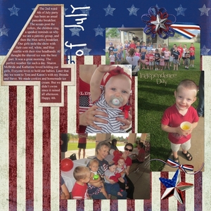 Vertical hanging of the flag background is nice and the journal in the "4" shape is great. Good arrangement of photos, too. Looks like a fun time.
 -
 I love this visual pun! The poster colors add so much. A lovely, classy layout.
 -
 I agree with the comments already made. I especially like the font you chose and the journaling. Home perms have come a long way! LOL
 -
Sweet Boy School Pictures 2012
Mlady Di commented on Murmer's gallery image in Jumpstart January - 2013
 Your sense of composition balance and artful blending really enhances an already great photo. For example, although the eyes in the large photo fall ~midway, the result is not static; our eyes are drawn to that happy face. Makes me smile right back. Thanks for sharing.
 -
 As KatieGrace already noted, the colors work well with your photos and I also like how you placed the little photos on the paw prints.
 -
 First time to try any calendar. I didn't think the photo fit the template photo area, so I "colored outside the lines" and used the photo as background. I wasn't happy with parchment paper behind May, so I tried using the same Intaglio Style I used on the dates, line, and year, on the mat. To delineate the photo from the mat, I began with a skinny line, then kept increasing its width until I liked it. I erased part of the line to let the flags in my photo show through. The result is far from my usual style, so suggestions on what I could do differently to improve it would be appreciated. Products used: KVE_SSTyle_Intaglio_7601 SNU_SSEmb_4x6BoldCalendar TYO_1776_Paper_BlueStar_Special SBA_SSStyles_BasicShadows_6501_Grey_Large
© D LaRue Jan 2013 ©